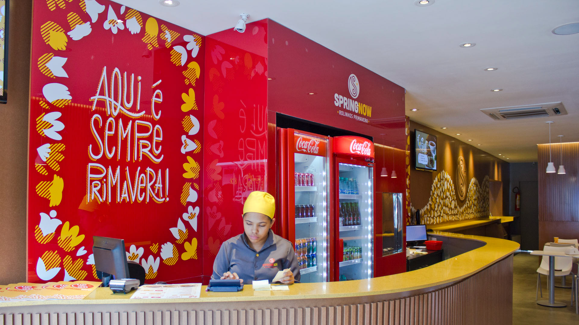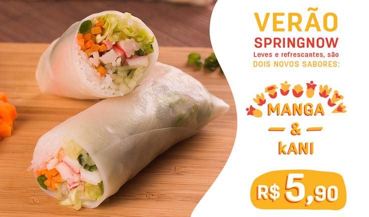

Springnow is a restaurant in Brasília that has only one expertise in its menu: spring roll. The main idea of SpringNow is that it is a place where people feel happy. This concept of happiness guided the whole project, from packaging and interior design to the way SpringNow would communicate with its customers.
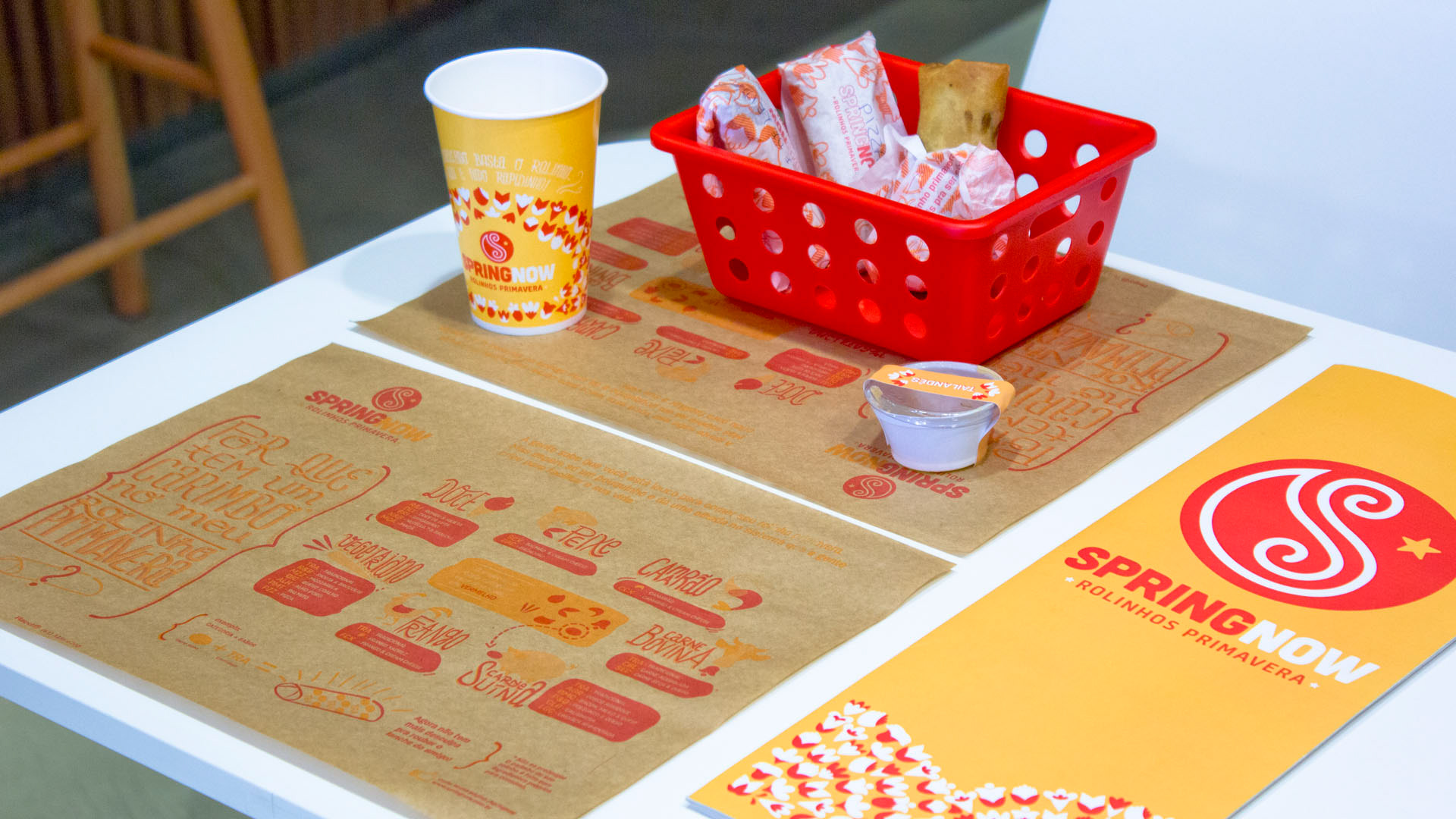
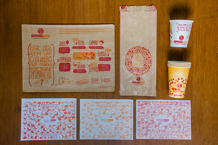
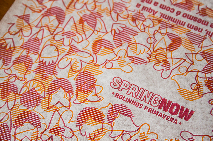
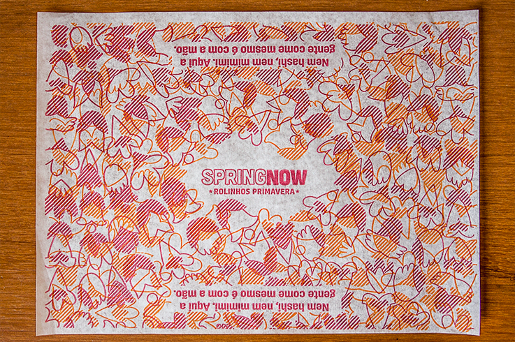
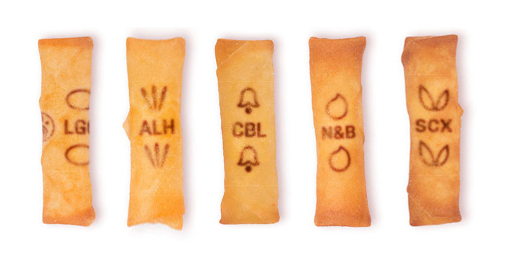
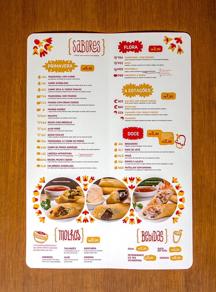
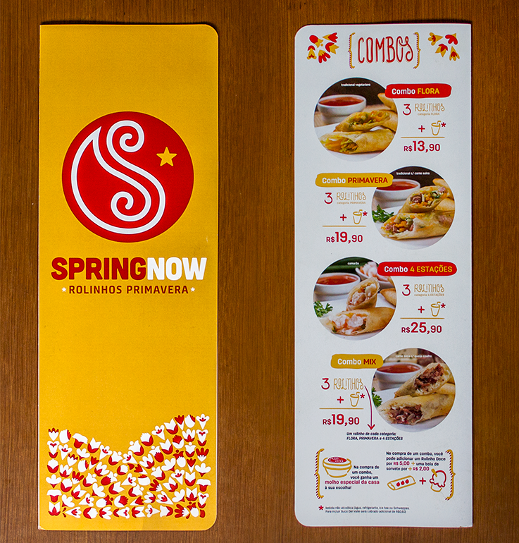
The logo (already made before the project) had to be standardized. To identify the filling of the rolls, it was necessary to design a simple and easy system to differentiate them. To solve it, a stamp system was developed and used throughout the project. The fillings were divided into seven categories (beef, pork, chicken, fish, shrimp, vegetarian and sweet). For each, an illustration was made, and part of this illustration became the symbol of the category. In addition, we developed a system of abbreviations for each type of flavour. For customers to better understand this system of abbreviation and symbols, an infographic explaining that it was made and placed on the tablecloth.
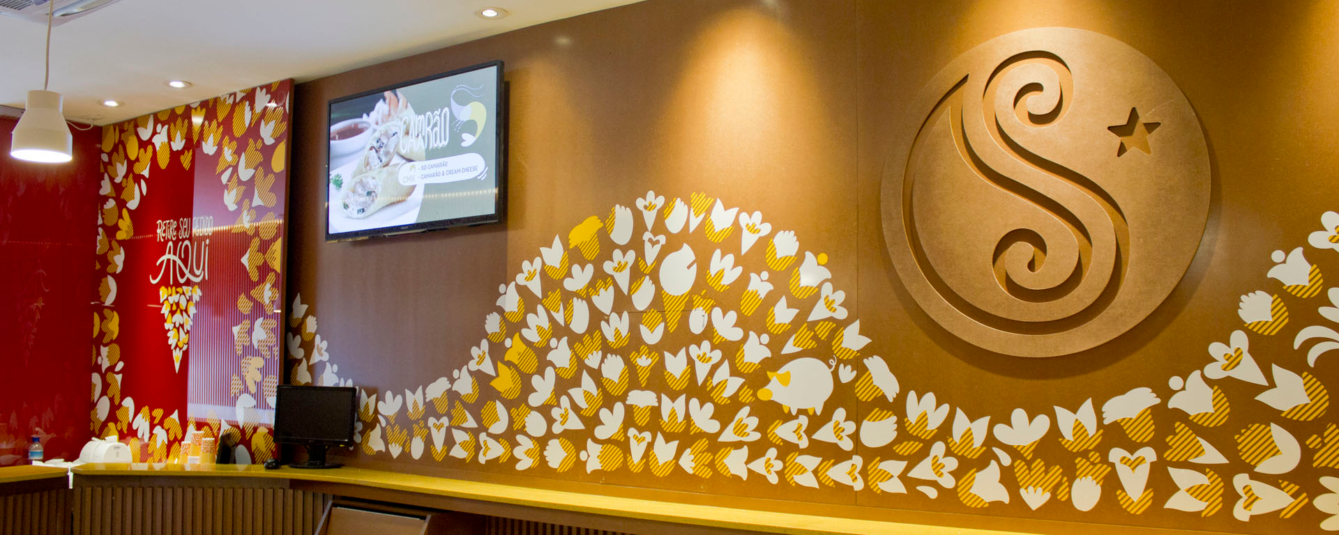
The graphic elements that make up the remaining graphic pieces are illustrations made for the seven categories, which have been decomposed. From the combination of the designs of the pieces of various flowers were created, and letterings were also made to contrast with the more rigid elements of the brand.
My Role: Graphic Designer, Illustrator and Project Manager
Company: Grande Circular