
The marketing team of Casa & Terra (Home & Land) has hired us to redesign their brand, as well as the signage of the head office and new website.
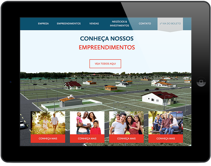
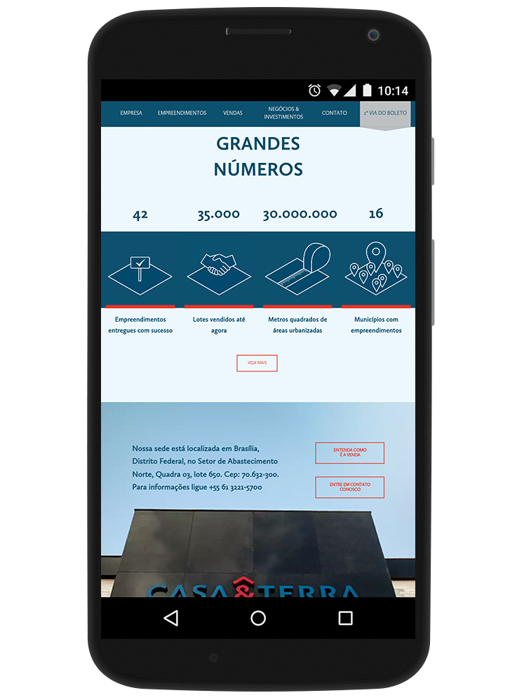
Casa & Terra is a company that has expanded over the years and today has sales ventures spread all over Brazil. The communication, starting with the visual identity, was outdated and did not represent the size and importance that the company had acquired over the years. The site should be simple, clean and effective as well as should be compatible with mobile devices.
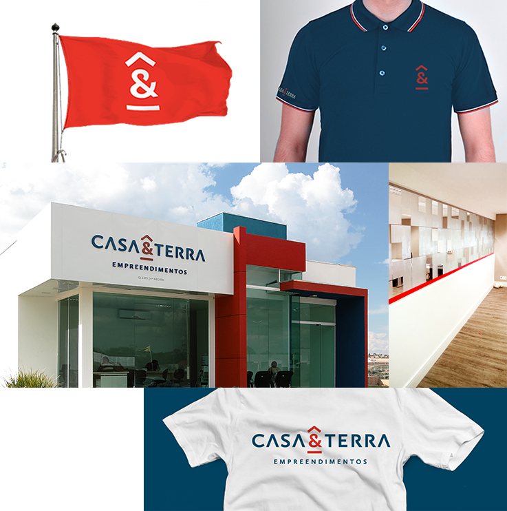
Although the former identity was not significant or striking, there was a great attachment internally and identification had to be preserved in the regions where they have offices. Therefore, the redesign needed to maintain the link with the previous identity. The goals of the new project were to increase credibility, communicate strength and standardize visual communication.
Although the former identity was not significant or striking, there was a great attachment internally and identification had to be preserved in the regions where they have offices. Therefore, the redesign needed to maintain the link with the previous identity. The goals of the new project were to increase credibility, communicate strength and standardize visual communication.
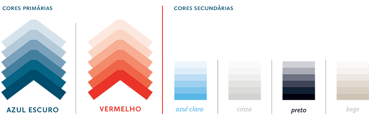
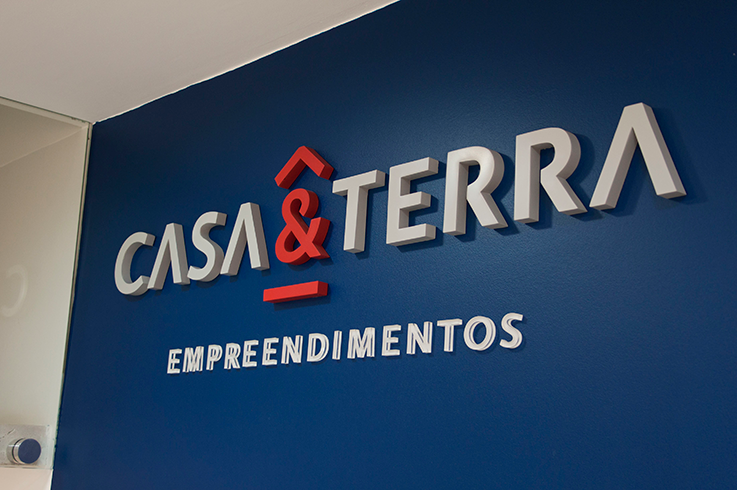
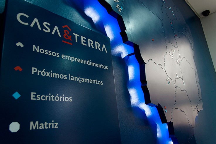
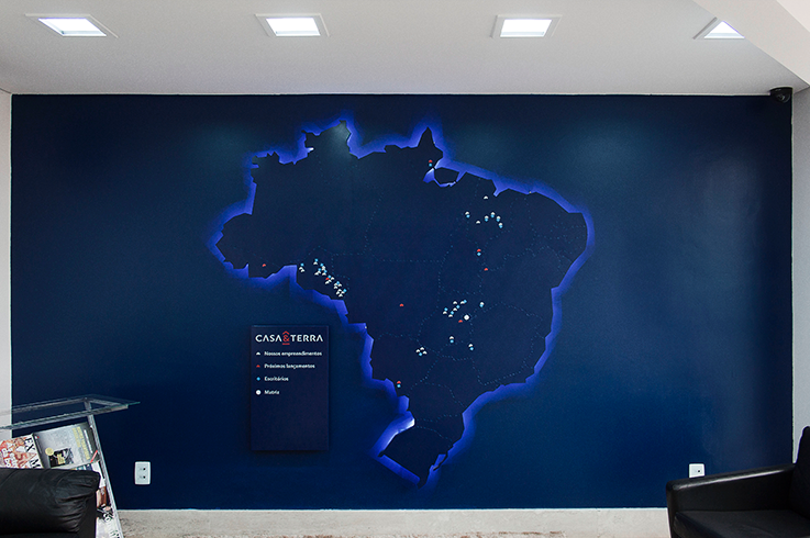
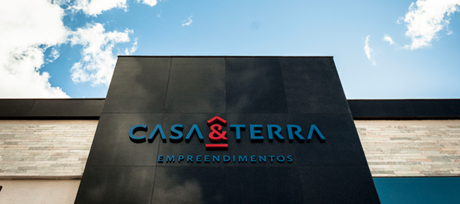
The colors were worked out to make them softer, darker and more saturated than the old brand colors. We modified the logo, leaving it more open and in capital letters, and created a symbol with a stronger concept that could be used separately as a coat of arms. The new symbol was created along with the company concept, as well as being a visual summary of the name. The application of the identity in the head office was done in an integrated way, creating applications of the logo and signage. Graphics and standards were also developed for the environment of the rooms and an infographic of the map of Brazil at the reception, which serves both to situate the projects and as an aesthetic element.
My Role: Graphic Designer
Company: Grande Circular